Do you know how many languages are spoken around the world? According to Ethnologue, there are 7,168 living languages spoken today! Some of these languages are found on the Internet, while there’s a growing need to accommodate other languages to reach a broader audience.
Businesses increasingly use their websites to reach new target audiences worldwide, with some of their site visitors coming from RTL-language countries. However, these site users rarely find a website that uses RTL scripts, with most websites designed for LTR languages (such as English). As a result, there’s a growing need for websites to cater to Right-to-Left language speakers.
Table of Contents
What is RTL Web Design?

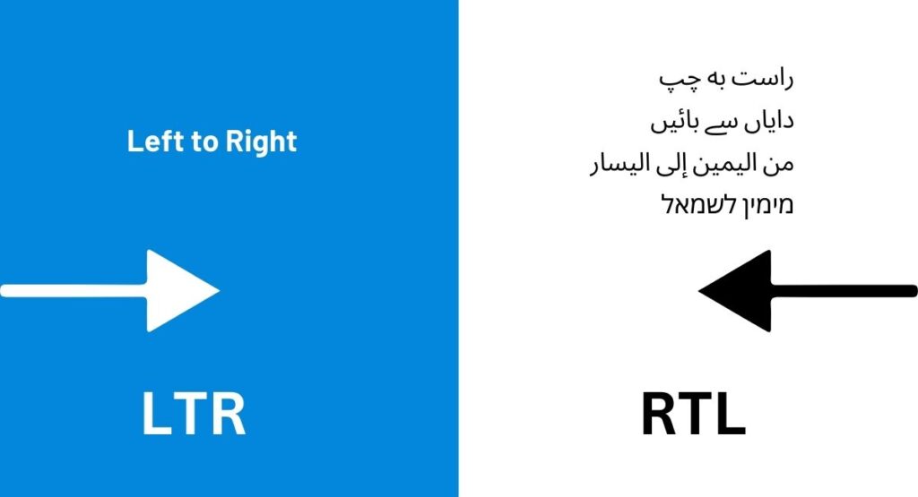
RTL is an abbreviation for “right-to-left.” The term is used to refer to languages that use scripts written from the right to the left, including the following:
- Persian
- Urdu
- Arabic
- Hebrew
- And others
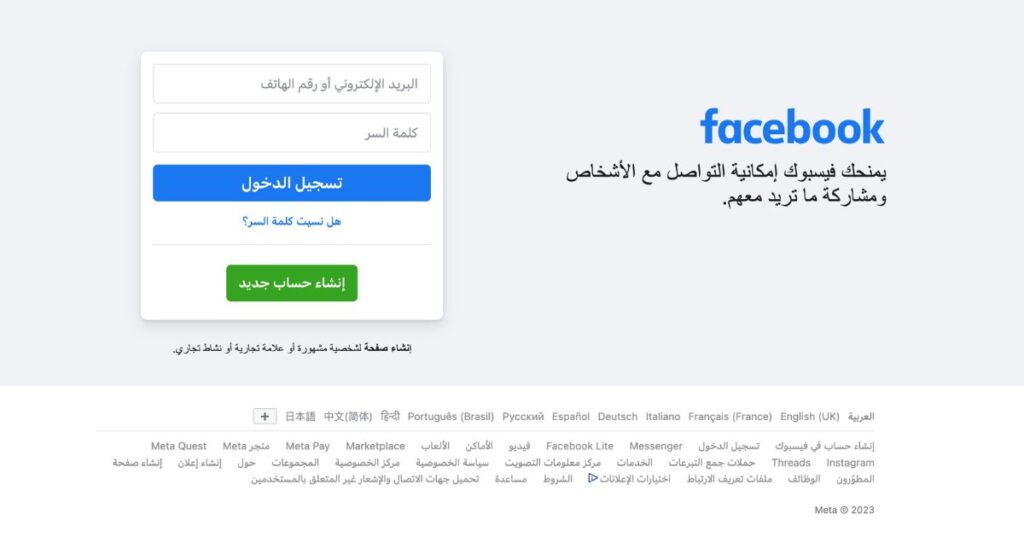
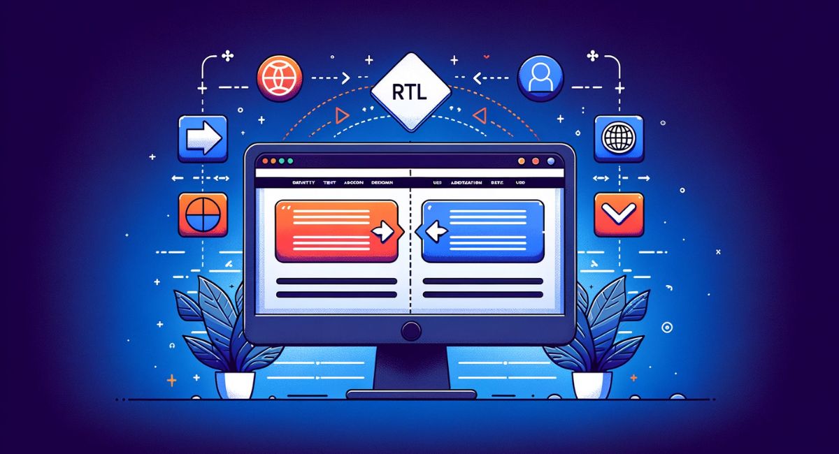
RTL web design means using web design practices that provide an excellent user experience for audiences that speak and read RTL languages. All content needs to be written in RTL; for instance, some elements must be flipped horizontally (for example, a backward arrow for LRT is “←,” while in an RTL script, the arrow would look like this “→.” This is only one example—the entire site and its elements must be designed entirely for RTL languages.
Related Articles : Urdu Translation in Marketing: Captivate Audiences and Expand Your Reach
The Importance and Challenges of Arabic Localization on the World Scene
The Significance & Uniqueness of the Hebrew Language
What are the Benefits of Having an RTL Website?

Designing your website for RTL audiences brings many benefits, including the following:
Broadened Audience Reach
Websites designed for RTL language speakers broaden their audience reach. According to W3.org, there are approximately 215 languages that use RTL scripts. Designing your website for these audiences means more customers, increased brand recognition, and more revenue.
Improved User Experience
People who speak RTL languages have difficulty using websites designed for LTR languages. The user experience is uncomfortable, which may make some site visitors leave and never return. That’s an unfortunate loss of site visitors and potential customers.
Websites designed for RTL languages provide a more comfortable experience for these target audiences. The sites are easier to navigate, and the content is more useful and satisfying to read. Ensuring the site provides an excellent user experience means the target audiences will return and stay on the site longer.
Enhanced Brand Image
Websites that use RTL design, along with translating and localizing their content, help site visitors and users better understand a company’s products, services, and other information. When site users feel more comfortable on a website, they’re more likely to become loyal customers as they develop more trust in the business.
In addition, a business that includes a right-to-left design also shows it cares for people who use RTL languages. These site users also become more loyal and may recommend the site to their families and friends.
Increased Sales/Conversions
Companies that target RTL language users appeal to a broader audience. These target audiences are better able to understand what the business is selling. They may also trust the brand and have an excellent user experience on the website.
4 Tips for RTL (Right-to-Left) Web Design

Before you try RTL website design, we suggest reading our tips and working with an expert translation agency that provides this service. The key to success is getting your right-to-left design right and ensuring it’s comfortable for site visitors.
Here are four tips to get you started with RTL website design:
1. Adapting Visual Flow with Intuitive Mirroring
Transitioning from LTR to RTL isn’t only about flipping the content. It’s also about ensuring the visual flow makes intuitive sense for RTL speakers. While key elements (such as navigational cues, certain icons, and calendar layouts should be mirrored), the real challenge lies in determining what doesn’t need to be switched (mirrored).
Preserving the global essence of universal symbols and brand names is crucial to avoid confusion.
2. Cultural Resonance Beyond Language
An RTL site is more than just a translation—it’s a cultural adaptation and dives deeper than only making linguistic changes. The goal is to reflect the ethos and sensitivities of RTL culture through imagery, iconography, and the nuances of the content.
Recognize and adapt to regional differences within the right-to-left community, from varying numeral usage to localizing cultural symbolism.
3. Crafting Typography for Readability & Aesthetics
One essential consideration concerning typography is that not all fonts are compatible with RTL languages. For this reason, it’s recommended to use multilingual fonts designed to support both LTR and RTL languages, such as Google Noto.
Beyond ensuring the chosen font supports right-to-left scripts, consider that the typography complements the language’s aesthetics. While popular fonts like Google Noto are safe choices, exploring regional typographic nuances can elevate the design. Adjustments in typeface weights, sizes, and leading can enhance readability and the overall visual appeal.
4. A Comprehensive Testing Regime
It’s necessary to conduct comprehensive site testing before any website goes live, including those adapted to different linguistic and cultural paradigms. This level of testing goes beyond spotting translation errors or checking browser compatibility. We’re talking about a holistic assessment of the entire website.
Ask these questions when conducting extensive testing of your site:
- Can a native user seamlessly navigate the site?
- Are there any cultural gaffes?
- Is the mobile experience as refined as the desktop version?
Conduct a 360-degree evaluation to ensure the website is genuinely ready for a worldwide audience.
How Can Pollion Help with RTL Web Design?
Pollion covers a majority of languages that require RTL we design, including Arabic, Hebrew, Urdu, and Persian. The translation agency understands the essentials of mastering right-to-left web design to adapt websites to right-to-left language markets effectively.
Your company website will demonstrate a commitment to providing an inclusive, culturally sensitive online experience for users from diverse language backgrounds, enhancing the reach and impact of the translated and localized content.
Conclusion
As a translation and localization company, investing in right-to-left design demonstrates your commitment to presenting content in a way that respects your target audience’s cultural norms and preferences.
By incorporating RTL design from the outset, your website becomes future-proofed for potential expansion into markets where right-to-left languages are predominant. This proactive approach not only saves time but also saves resources down the line.
Mastering RTL web design is crucial to creating a holistic, user-centric web presence. By focusing on responsive layouts, text direction, imagery, and cultural nuances, you deliver a visually appealing website and foster a sense of belonging and accessibility for users from right-to-left language backgrounds.
Delving into the world of RTL web design, you position your company as a forward-thinking localization partner capable of catering to the diverse linguistic needs of a global audience.
